LOS B requires us to:
describe the construction of different types of technical analysis charts and interpret them.
The basic tool in technical analysis is movement in prices measured by charts. It is for this reason that technical analysts are sometimes called ‘Chartists’. We have discussed below three types of charts that are commonly used.
Line Charts
a. Line charts are simple graphs drawn by plotting the closing price of the stocks on a given day and connecting the points thus plotted over a period of time.
b. The charts are easily drawn and widely used in technical analysis. And line charts help in the easy identification of patterns.
c. The price is marked on the Y-axis (or the vertical axis) and the period of time on the X-axis (or the horizontal axis) as follows:
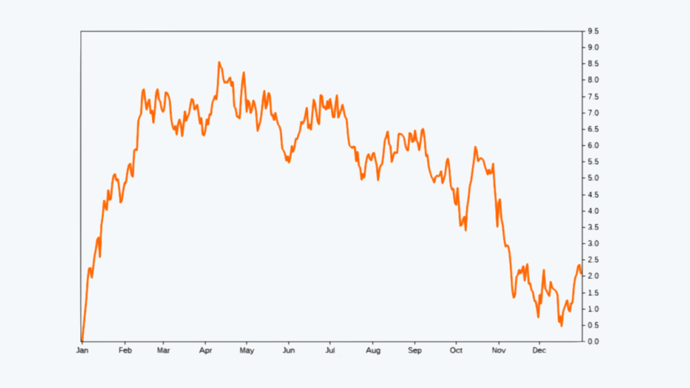
d. The data points that are plotted are usually the closing prices. The scale can either be linear or logarithmic depending upon the scale of data. For data with larger values, a logarithmic scale is better and for the data of smaller scale, a linear scale is best suited.
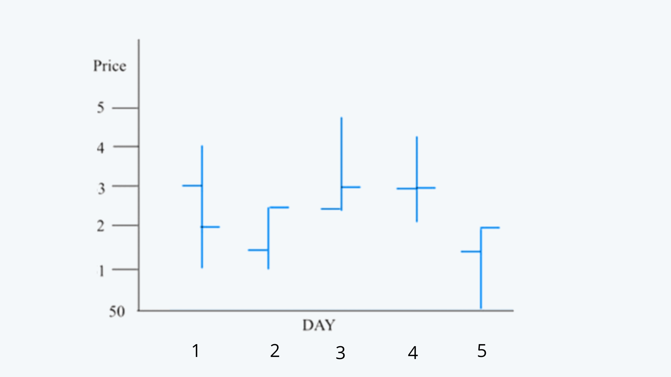
Bar Charts
a. In order to draw a bar chart, the data on a day’s high, low, opening prices, and closing prices are necessary.
b. To plot a stock’s price movement, the high and low reached on a said day is marked and connected by a vertical line.
c. The horizontal-tick line to the left represents the opening price while that on the right represents the closing price.
d. The length of the bar indicates the divergence between the high and low prices.
Following is an example of a bar chart:
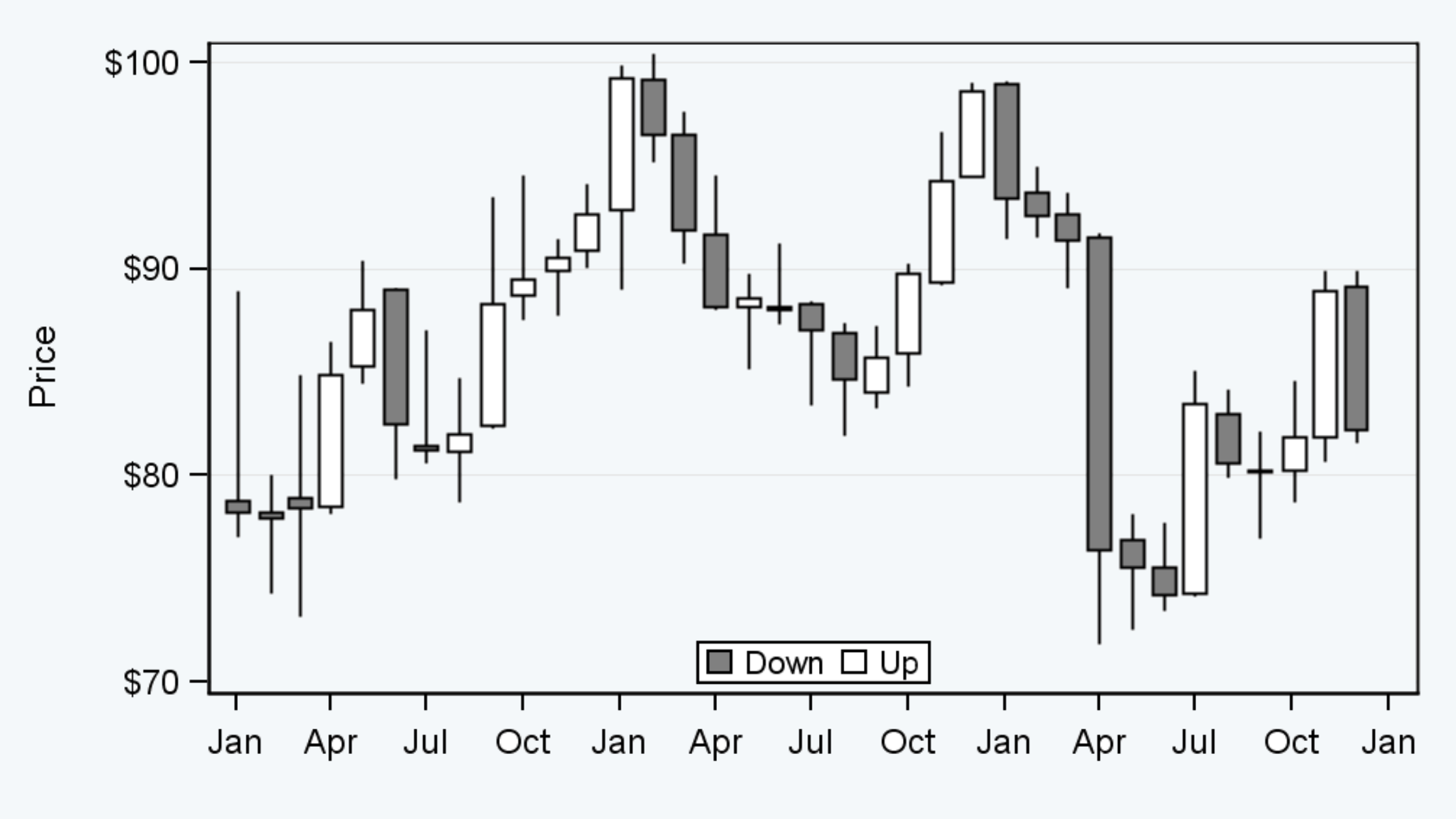
Candlestick Chart
a. Like bar charts, the data on a day’s high, low, opening prices, and closing prices are necessary for drawing a candlestick chart.
b. Here also the vertical line shows the difference between the high and low price of the asset.
c. The candles represent the difference in the closing and opening price.
d. In some candlestick charts, the candles are of red and green color. The green candles represent the rise in closing price over the opening and opposite for the red candles.
e. But, in most cases, the candles are hollow and shaded. The shaded candle represents a fall in the closing price over the opening price.
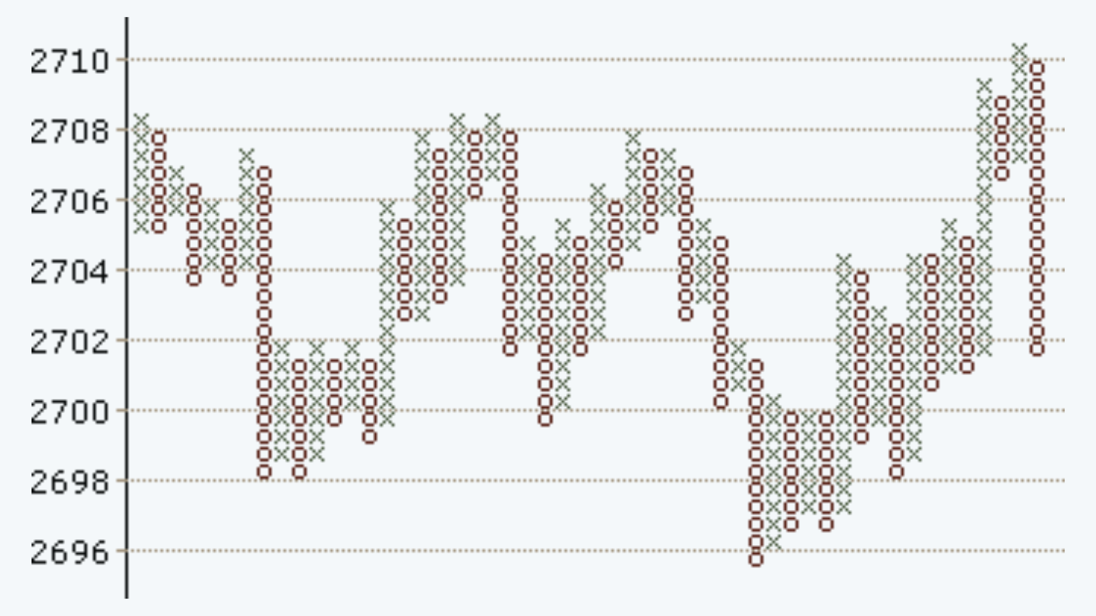
Point and Figure Chart
a. The point and figure chart are different from all of the above-discussed charts in the sense that all the above charts are plotted at specific time intervals, the PFC does not have a time dimension. A PFC concerns itself only with the measurement of prices.
b. Further, a PFC does not measure every movement in price. Unlike the bar charts, PFC records changes in price that are larger than a specific amount called points.
c. For example, a PFC can be constructed to measure changes in prices over and above $2. Such a chart is called a 2-point chart.
d. Some chartists chart graphs with varying point sizes for the same stock for better analysis. The decision about the size of a point is essentially based on the price range and degree of volatility of the stock.
e. Construction of a PFC involves the use of 2 symbols – ‘X’ and ‘O’. While ‘X’ indicates an increase in price, ‘O’ indicates downwards movement.
f. PFCs are plotted on cross-section arithmetically ruled squares.
i. If a 2-point PFC is to be plotted, the graph may begin by recording the price at a chosen level.
ii. Across the price levels marked on the Y-axis, either ‘X’ or ‘O’ is marked for the beginning price.
iii. A subsequent change in price level is noted.
iv. If the price increases, for every increase equal to or over $ 2, an ‘X’ is marked on the same column if the chart began with ‘X’ mark for the beginning price level.
v. A decrease in price over and above $ 2 is treated as a change in direction.
vi. The chartists then shift to the next column and mark a series of ‘O’s to indicate the magnitude of fall in prices.
vii. No marking is made if the prices remain at the same level or changes are less than $ 2.
viii. Prices are marked in the same column irrespective of the time period as long as the direction of change remains unaltered.
Typical points and figure chart looks like this:
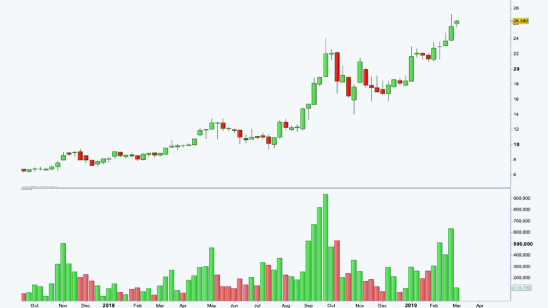
Volume Chart
a. Volume is counted as the total number of shares that are actually traded (bought and sold) during the trading day or specified set period of time. It is a measure of the total turnover of shares.
b. The volume determines the conviction of buyers and sellers when determining the price of securities.
c. Most charts have details of traded volumes below them.
d. If there is an increased price accompanied by the increase in volumes, it is considered a very positive sign as it represents the faith of the market in the given asset.
e. On the contrary, if there is a decrease in the volume of trading accompanied by a price rise, it means that the market participants are not willing to buy at that price. And if this trend continues, the market will correct itself, and a fall in price can be expected.
A typical price-volume chart looks like this:
Scales
a. For any of the charts discussed above the vertical axis can be constructed with either a linear (arithmetic) scale or a logarithmic scale.
b. The linear scale reflects an equal dollar change in the market price of the securities.
c. The logarithmic scale, on the other hand, reflects the equal percentage change in the prices.
d. The linear scale is appropriate for the smaller range, whereas the logarithmic scale is more appropriate for a larger range of price changes.
Time Interval Charts
These charts reflect the price movements on the basis of specified time intervals. Such as, we could have yearly, monthly, weekly, daily, hourly, second-wise charts.
Relative Strength Analysis
The relative strength analysis is done relative to the benchmark performer, whether the stock in question has outperformed or underperformed the respective.