LOS C and D require us to:
c. calculate and interpret relative frequencies and cumulative relative frequencies, given frequency distribution.
d. describe the properties of a data set presented as a histogram or a frequency polygon.
a. The frequency distribution is a tabular display of data grouped into intervals. For example:
|
Marks |
Number of Students |
|
0-20 |
0 |
|
21-40 |
11 |
|
40-60 |
28 |
|
60-80 |
23 |
|
80-100 |
8 |
|
Total |
70 |
The first column above shows the intervals, and the second column shows the number of observations in each interval or the absolute frequency.
The frequency distribution intervals work with all measurement scales.
b. A frequency distribution can be constructed using the following methodology:
i. Sort the data in ascending order,
ii. Calculate the range, i.e. the maximum minus the minimum value (max-min),
iii. Choose the number of intervals (k),
iv. Determine the interval width using the formula: (Max – Min) / k
c. While preparing a frequency distribution, it is extremely important to select the intervals properly. If the number of intervals is too few, it means that there is too much aggregation and too little. However, if the number of intervals is too many, it means that there is too much aggregation and too less details.
And, the decision with regard to the number and size of intervals come from the type of data to be analyzed, the number of observations, and the nature of analysis and experience.
d. The frequencies could also be of different types, such as:
i. Absolute Frequency: It is the exact number of data falling in a particular interval.
ii. Relative Frequency: It is the amount of frequency as a percentage of a total frequency falling in a particular interval.
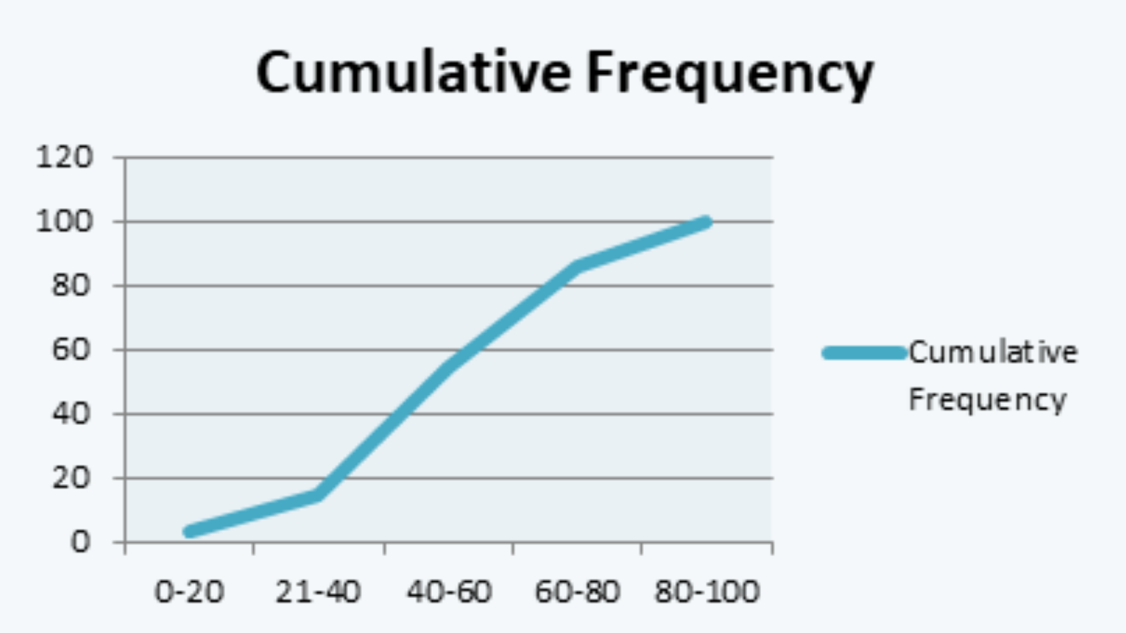
iii. Cumulative Frequency: It is the sum of the absolute frequencies of the current interval and all the proceeding intervals.
iv. Cumulative Relative Frequency: It is the percentage of cumulative frequency of a particular interval to the total frequency of the data.
These frequencies could be understood with the help of the following example:
|
Marks |
Number of Students (n) |
Relative Frequency |
Cumulative Frequency |
Cumulative Relative Frequency |
|
0-20 |
3 |
0.03 |
3 |
0.03 |
|
21-40 |
11 |
0.11 |
14 |
0.14 |
|
40-60 |
40 |
0.40 |
54 |
0.54 |
|
60-80 |
32 |
0.32 |
86 |
0.86 |
|
80-100 |
14 |
0.14 |
100 |
1.00 |
e. The data of frequency can also be presented in a graphical form in one of the following forms:
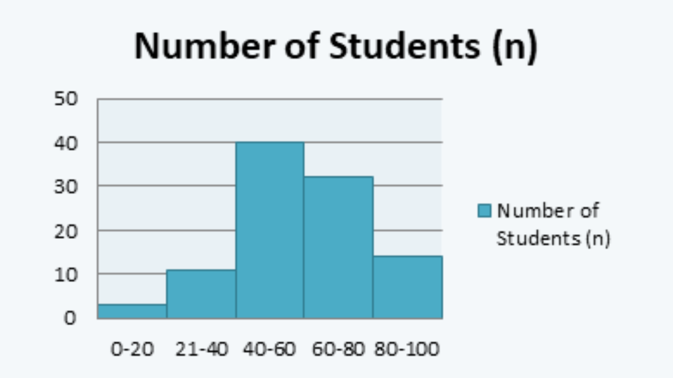
i. Histogram: The histogram is a bar chart of the frequency distribution. The histogram for the above data of marks-interval and its respective absolute frequency, i.e. number of students can be presented as follows:
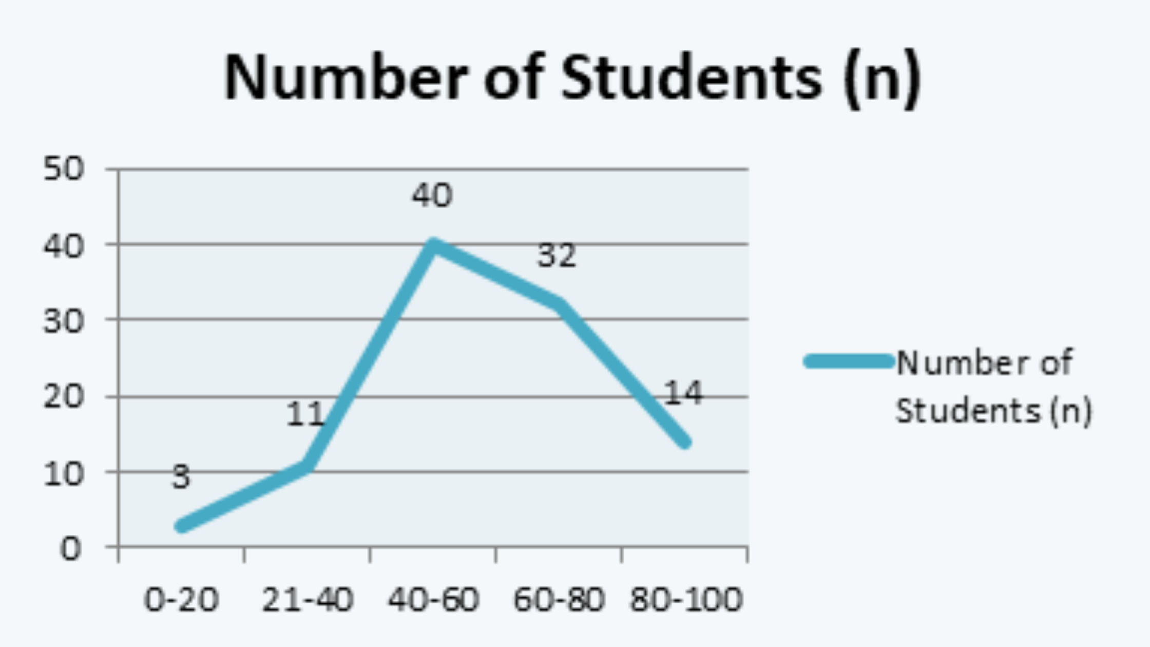
ii. Frequency Polygon: A frequency polygon can be drawn by joining the midpoints of the top of the histogram, as follows:
iii. Cumulative Frequency Distribution Line: It can be drawn just like the frequency polygon, except that the data we take is of cumulative frequency instead of absolute frequency.